
Semiotic Flashcards - Back to "Normal"

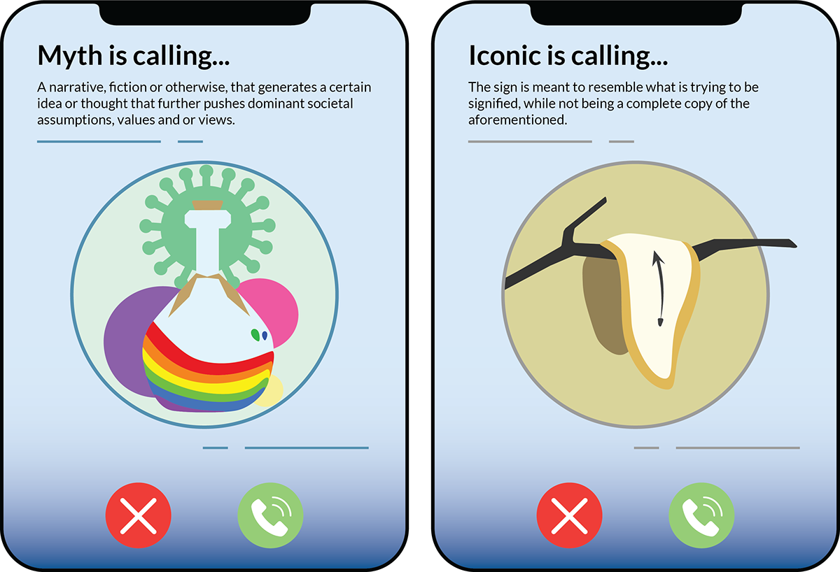
In this project, our team was tasked to design flashcards explaining semiotic concepts, under the theme "Post-Pandemic World". We created our cards around the concept of "Back to Normal", which explores what the new normal is in a post-covid-19 world. We explored the different meanings and new forms of connections people have with each other, including social distancing, video-calling, and ways of working.
The cards were designed under a theme of video calling, with the package design being a phone. This is because during the pandemic, video calling was a crucial way for people to connect and see each other, and we believe this will continue in the post-pandemic world.
Product Shots


Package Design (Michelle and Christi)

Michelle's Work
In these designs, I wanted to explain the terms Irony and Indexical using common issues from the pandemic, sickness and vaccination. For the Irony card, I illustrated a person sneezing, who is in jail, which demonstrates the meaning of the word with context with the pandemic. Before the pandemic, people were encouraged to attend school or work, even when they were sick, because of the lack of sick days and trouble accommodating sick people. With the pandemic, any signs of illness are frowned upon and people are scared of getting sick. This contrast is ironic because sneezing changed from being innocuous to something almost life-threatening. For the Indexical card, I illustrated a vaccine being given to a heart, which represents that being vaccinated can mean that you are in good health. This isn't necessarily true, but the term Indexical looks at how there is a physical or causal connection from the image to what is being messaged, so a vaccine is an index of good health in many people's perspectives.


Christi's Work

Mitchel's Work
Kesha's Work


PROCESS
Week 2: Group project starts (virtual discussion and brainstorming)
Short Summary:
An achievement I accomplished this week is completing various illustrations of my ideas for the Semiotic Flashcards group project. I completed 4 different designs on Illustrator and uploaded them on the group ppt template. I aimed to created more than one idea for one of my chosen terms because I wanted feedback and suggestions which would be given the following week from my peers and TA. I am proud of briefly explaining the meanings behind the illustrations I created and talking about how it relates back to my group's theme (post-pandemic, life going back to "normal"). I explained this on the group ppt. This week I learned about how visual elements (representational images) help viewers understand theories. Design as cultural production appears as a space, a tool, an object, and an ideological message within culture and society to facilitate everyday life activities. Inspiration for designers exists within a culture and society, whether that be local, cross-cultural, and/or global. Visualization strategies for designers are the vernacular approach, cross-cultural approach, and/or the transnational approach. I learned that a sign is a physical signal that stands for something other than itself, a code is a system of meaning common to culture/group > comprised of signs + convention, and feedback is information transmitted back to the sender (observation, analytics). I also learned about things that can apply to design such as effective communication strategy, honing in on relevant communication (i.e. cropping tool, manipulation), adding/subtracting information, avoiding unnecessary noise/visual clutter, and understanding that less is actually more (cutting down design to essential elements, simplifying). Relating to course material, I learned how communication is a simple, linear process and how redundancy (high predictability > familiarity and recognition > more easily communicated) and entropy (low predictability > less familiar > more difficult to communicate) work together. Redundancy helps us decode a message/overcome a noisy channel, resulting in reaching a wider audience. Entropic messages need more information to overcome communication problems, resulting in design that breaks convention (entropic) and connects with a specialized audience through entropy.
Week 3: Desk crit < Writing & Ideation
Short Summary:
An achievement I accomplished this week is receiving critical feedback from my TA and peers on my rough draft comps for the semiotic flashcards. I received suggestions and comments on what to change and alter in order to make my comps better for the following week. Another achievement I accomplished this week was adding colour to my comps for the prelim final design review next week. Me and my group scheduled a call to discuss our progress and to come to a collective agreement on what colour schemes to use for the flashcards and the packaging. This week, I briefly learned about contemporary artists of the 60-70s as well as our modern times. Cindy Sherman’s B&W pictures of herself in a variety of poses were shot on set meant to advertise films and refer to publicity by exploring the stereotypes in film. Sherman referred to films from the 50-60s, B movies, and/or European art house films. However, none of her photographs depict actual films as they are entirely based on fictional moments. Her body of work aims to portray variation of female types. In her works The Girl on the Run, The Bombshell, The Bored Housewife, and The Vamp, Sherman depicts a variety of characters that are “familiar but spark our own narrative”. The late Vivian Maier captured eye-catching street photography but remained a private person and kept her work private. No one discovered her work until she passed away. Kimiko Nishimoto is a photographer and internet celebrity known for dressing up in fun costumes and posting entertaining pictures on Instagram for the public. Viewers find her posts unique and entertaining. Referring to the weekly reading, I learned that semiotics = sign + codes + culture. Signs are commonly used to communicate short, important messages in simple yet effective way. American philosopher Charles Peirce proposed that these signs could be categorized into three groups: icon, index, and symbol. An icon is a graphic element reduced to its most simple characteristics, an index is a graphic element that has a direct link to an object, and a symbol is a graphic element that communicates a certain concept. An icon resembles its object/has biological features, an index is an indication of context/associated with gender-related business retire, and a symbol is abstract/representational of an object, concept, idea, or action. However, these three categories are not separate or distinct (i.e. a paradigm is a system or code, whereas a syntagm is a message combined with system or code. Convention also plays an important variety of roles in communication and signification. Our experience of different signs, that is our experience of the convention, is what enables us to respond accordingly and appropriately. On pg. 44 on this week's reading, it states, "...fallacy of believing that the signifieds are universal". This tells us that social dimension of signs evaluate the value/significance/relationship of the sign to others in the system (i.e. target audience, culture, context, environment/surroundings).
Week 4: Prelim final design reviews < Digital comps for 8 flashcards
Short Summary:
An achievement I accomplished this week is completing my prelim final designs for review and received good feedback from peers and TA to further refine the flashcards for the final submission next week. I learned about literary theorists such as Saussure, who focused on linguistic application (semiotics = sign + code + culture) and Ronald Barthes, who focused on meaning and placed two orders of signification (denotation; first order of signification, common sense, clear meaning to the sign, and connotation; second order of signification, considers interaction between viewers, feelings/emotions, cultural views). An apple, in terms of denotation, would be a fruit (describing what we think/see). However, in terms of connotation, when looking at a painting of Adam and Eve, the appearance of an apple is a forbidden fruit symbolic of knowledge, immorality, temptation, the fall of man, and sin (higher, more in-depth level of meaning). Likewise, when looking at a waterlilly, in terms of dennotation, it is a flower. However, in terms of connotation, a waterlilly holds cultural and symbolic significance. In Christianity symbolic of innocence, fertility, and purity, in Hinduism symbolic of resurrection, in Buddhism symbolic of enlightenment, scientific significance (flower dates back to 60 million years), in Ghana it is respected for medical purposes, in Mexico symbol of earth, in Ancient Egypt symbol for national unity, and in Asia represents universality. A metaphor is a figure of speech that directly refers to one thing by mentioning another and may provide clarity or identity hidden similarities between two different ideas. The workplace images of a chair, cabinet, and graph with arms and legs is a metaphor depicting the message to be a part of the conversation, not the background. Anchorage fixes the context of an image by anchoring the meaning of the image while the text leads the way in which one interpets images by narrowing the meaning of the image. Relay is when text complements the image and further meaning to the image. An example of anchorage: an image of an apple shows there is an apple. However, when placing meaningful text underneath it changes the whole concept; “this is sin”, “this is love”, “this is toxic”, “this is locally grown”, “this is wisdom”. An example of relay: an image of a dog being unaware of the “danger sign" which is meant for him (he does not think/is not aware he is dangerous). Analogy is a comparison between one thing and another. Represented in the three posters: “Chemistry. As easy as a child’s play”, “Biology. As easy as a child’s play”, “Geometry. As easy as a child’s play”.
Week 5: 5-min Presentation < Flashcards refinement < Digital mock-up < Submission
Short Summary:
An achievement I accomplished this week is completing the Semiotic Flashcards group project and refining my digital comps. My group and I arranged calls outside of Zoom to discuss our work and share our individual progress for the group project. Several variations, drafts, and alternatives later we came to a collective decision on the overall template, pocket cover, and mock up of the final flashcards. I worked towards refining my own cards and fixing it with the given feedback and suggestions I received last week. A reflection highlighting what I learned: in this week's reading, we focused on the politics of design. Functionalism means that everything in society must serve a purpose including art and design, practicality, and design being used as a function instead of for beauty/aesthetic purposes. I learned how Ray Gun collaged magazines by David Carson portrayed the idea of how it is wrong to "create disorder without a purpose". His collages serve a purpose and are not "messy" as many critics assume as he presented his work in an anti-grid layout. Carson focused on pop culture, grunge typography, design, fashion, technology, urban life, trends, and music. Referring back to the "Politics of Style" reading, design trends often dictate who gets hired in the workforce as "what is popular" in the design world continuously evolves (photography replaced illustration). Traditional art forms got replaced with technology as the digital/tech trend came forward (radio, television, Youtube, social media, AV/VR). In today's world, designers find it challenging to stand out. One has to be experimental and integrated as cross-platform design comes with society's "pressure to know it all". Further consideration and influences as stated, "In matters of aesthetics, unfamiliarity often breeds contempt". To me, art and design critics and dictatorship both play a role together as without effective communication (lack of it, unfamiliarity), design is disrespected or frown upon. There should be importance placed on balance: form (style) + communication (message). Lastly, design struggles/clashes often occur due to a result of generational differences. The quote, "Ultimately, graphics belongs not to the designers who bring them into being, but to the audience they are aimed at and the society at large… graphic designs quickly become cultural artifacts satisfying an era", portrays the idea of how graphic designers (now and then) have always worked for the audience and making a long-lasting change in by the use of visual concepts to usefully communicate ideas that inspire, inform, and captivate consumers.
An achievement I accomplished this week is completing the Semiotic Flashcards group project and refining my digital comps. My group and I arranged calls outside of Zoom to discuss our work and share our individual progress for the group project. Several variations, drafts, and alternatives later we came to a collective decision on the overall template, pocket cover, and mock up of the final flashcards. I worked towards refining my own cards and fixing it with the given feedback and suggestions I received last week. A reflection highlighting what I learned: in this week's reading, we focused on the politics of design. Functionalism means that everything in society must serve a purpose including art and design, practicality, and design being used as a function instead of for beauty/aesthetic purposes. I learned how Ray Gun collaged magazines by David Carson portrayed the idea of how it is wrong to "create disorder without a purpose". His collages serve a purpose and are not "messy" as many critics assume as he presented his work in an anti-grid layout. Carson focused on pop culture, grunge typography, design, fashion, technology, urban life, trends, and music. Referring back to the "Politics of Style" reading, design trends often dictate who gets hired in the workforce as "what is popular" in the design world continuously evolves (photography replaced illustration). Traditional art forms got replaced with technology as the digital/tech trend came forward (radio, television, Youtube, social media, AV/VR). In today's world, designers find it challenging to stand out. One has to be experimental and integrated as cross-platform design comes with society's "pressure to know it all". Further consideration and influences as stated, "In matters of aesthetics, unfamiliarity often breeds contempt". To me, art and design critics and dictatorship both play a role together as without effective communication (lack of it, unfamiliarity), design is disrespected or frown upon. There should be importance placed on balance: form (style) + communication (message). Lastly, design struggles/clashes often occur due to a result of generational differences. The quote, "Ultimately, graphics belongs not to the designers who bring them into being, but to the audience they are aimed at and the society at large… graphic designs quickly become cultural artifacts satisfying an era", portrays the idea of how graphic designers (now and then) have always worked for the audience and making a long-lasting change in by the use of visual concepts to usefully communicate ideas that inspire, inform, and captivate consumers.
What I liked the most about this project was working collaboratively with my peer members and learning more about semiotics. I had a lot of fun working with others even though it was entirely online. We went through many critiques and process work to reach the final stage. The final flashcards depict two semiotic terms which we were each assigned and had to design design concepts that visually communicated the terms to the viewer. We had to make simple, abstract designs using shapes, colours, lines. Using Adobe Illustrator, we worked with each other to make a cohesive set of flashcards depicting each of the terms we were given. I enjoyed learning and researching about semiotics while working to complete this project.
Challenges I faced while completing this project was finding ways to effectively and accurately visually showcase the two terms I was assigned with: Denotation/Connotation and Relay. The feedback and critiques I received each week encouraged me to further develop my ideas and depict the terms assigned. I had difficulty with the term "Relay" as I could not think of any ways to showcase it visually. I overcame this challenge by brainstorming and listing ideas of how our group's theme of "Back to Normal" could relate to the term and how I could visually integrate this into my cards.


